
It’s time to take a look at the cover of Colossus. I’ll admit that I don’t know a lot about cover design, or specifically what works and what doesn’t, and what little I do know I found out after I had formulated the idea for the cover in my mind.
The first decision was the format. I wanted to go for a simple artwork-with-text-overlay approach. Although fairly straightforward in concept, it puts emphasis on the artwork as that’s what has to convey the content. A single-word title reveals little, and I’m hardly the sort who can plaster their name in giant letters and be assured of sales. After all, nobody’s heard of me. The artwork then is key, and fortunately I already had the form in mind.
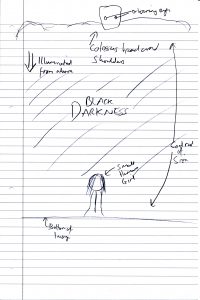
What we see here is the sketch I made to try and convey my idea. The key elements were the idea of darkness, a visual likeness of the character of Colossus, a contrast in size between Colossus and the depiction of Alice. The two lead characters are the core of the story, and I also wanted to show the idea of Colossus appearing protective of Alice, looking out over her. I was also hoping that someone could see the image and the thought would occur to them, a curiosity as to who these characters are, how they are connected.
What we see here is also about the limit of my artistic ability. Fortunately for myself I had the opportunity to live with a good friend whom I consider to be a skilled artist during my time at University. He was kind enough to transform the crude drawing into something I could put on the front of my story. I’ve waited far too long already to give him the credit he deserves, so you can find Chris’ deviantART profile here and his website here. He’s also listed as illustrator for the Kindle version of Colossus.
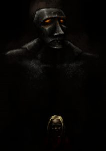
Here we see the (shrunk down) result of that transformation. The moment I first saw this image the characters, Colossus and Alice, took on a new life in my mind. Until this moment they had only been visualised in my head and, to his credit, what we have here is pretty close to the mark. It was exactly what I needed to put the final touches to Colossus to make it ready for self-publishing.
All that was left at this point was to add the title and my own name. I elected for a simple white text for maximum contrast with the background and readability. The only point of indecision on my part was exactly how to put my own name on it. For some reason I was apprehensive about pinning my full name to it, perhaps in case it was actually a terrible read and I would be forever shamed. (Which could still happen, admittedly.) I created two variations, one with “Daniel Smedley” and the other with “D J Smedley”, the latter of which I opted for mainly because I preferred how it looked.
Plus having initials is all mysterious.
Or something like that.
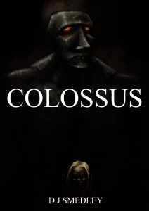
And here is the finished article, in all its glory. Nobody could see that and not buy the book.